Moderators: rtb, kmax, SonomaCat


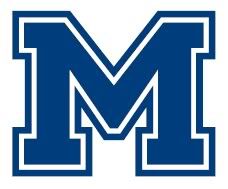
Well, it makes everyone think we are Michigan (especially when the M has yellow in it) ... at least that's been the reaction from 99% of the people who comment when I wear my gear.LTown Cat wrote:The M separates us.

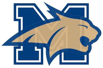
I like that idea ... it would remove the Michigan taint and look sharp.WeedKillinCat wrote:I like the Cat logo but would like to see it overlay the M
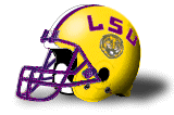
goat wrote:Something like LSU has would be pretty sweet. MSU above the cat head. Not sure how to put a photo of the LSU helmet on here if someone could lend a hand.

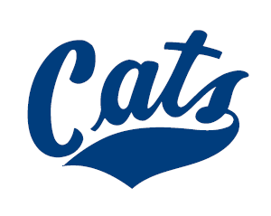
I absolutely love the M logo on the Jerseys and for most part on the helmets. I would like to see MSU go back to the Cats scripting though (even though matches the Griz). I think that would kind of pair us with the Grizzlies side by side as the 2 Montana teams (and MSU had the cursive logo first I do believe). I would love to see the helmet the way it is on my Avatar. I think that would look sweet with our current uniforms.longhorn_22 wrote:In regards to putting it on the helmets:
Well--for awhile that was a picture of LSU's helmet. They must have some sort of security on their images.LTown Cat wrote:goat wrote:Something like LSU has would be pretty sweet. MSU above the cat head. Not sure how to put a photo of the LSU helmet on here if someone could lend a hand.
that's what i have always wanted to see too. could someone here with some photoshop skills throw that one together?WeedKillinCat wrote:I like the Cat logo but would like to see it overlay the M

ilovethecats wrote:that's what i have always wanted to see too. could someone here with some photoshop skills throw that one together?WeedKillinCat wrote:I like the Cat logo but would like to see it overlay the M
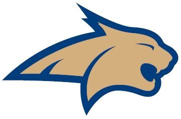
That dead rat reference was directed at the previous Cat head logo. Not the current one. And I believe Kramer coined that.AlphaOAlum wrote:The M on the helmets was instituted in 2000. It initially was proposed to include either "state" or "Bobcats" through it, but when printing it on the helmet the whole thing looked too messy and was unreadable. I don't have a marketing degree, but I'd assume that the important thing about a logo is that it be instantly recognizable and didn't need further inspection to clarify who the logo represented.
I have a strong strong dislike for the elongated bobcat head. I recall a recruit once asking dad why the "dead rat head" was everywhere?
That said, it might surprise you that I voted for the script 'Cats. I've been looking all over town for one of the dark blue shirts with the gold script 'Cats, but all I can find is stuff with the dead rat head on it! I'd also be amenable to the old school bobcat head, which I unfortunately cannot find an image of.
Dang, I wish I could find the rounded one! You know what I'm talking about though, right? Usually a yellow face on a blue background? I kind of like the old school-ness of it.longhorn_22 wrote:That dead rat reference was directed at the previous Cat head logo. Not the current one.

AlphaOAlum wrote:Dang, I wish I could find the rounded one! You know what I'm talking about though, right? Usually a yellow face on a blue background? I kind of like the old school-ness of it.longhorn_22 wrote:That dead rat reference was directed at the previous Cat head logo. Not the current one.
The dead rat head was definitely at the elongated bobcat head on so much gear right now. It was during a basketball game and that logo was on center court.
* Edited to fix italics, and say: I'm probably not a very fair opinion on the "dead rat head thing". I'm obviously pretty biased against it (for reasons I really can't discern!). I prefer the M or the script 'Cats. 1984 throwbacks man!


NO! That is hideousnevadacat wrote:
Like GOKATS' user image?AlphaOAlum wrote: Dang, I wish I could find the rounded one! You know what I'm talking about though, right? Usually a yellow face on a blue background? I kind of like the old school-ness of it.

LOL, YES, that is EXACTLY what I've been googling for. That image. Yeesh. I knew I'd seen it somewhere recently!longhorn_22 wrote:Like GOKATS' user image?AlphaOAlum wrote: Dang, I wish I could find the rounded one! You know what I'm talking about though, right? Usually a yellow face on a blue background? I kind of like the old school-ness of it.
A friend of mine referred to it as the "puking panther." I didn't like it at first, either, but it's grown on me. I have it as the wallpaper of my laptop computer. It's amazing how many times people at presentations ask, "Did you go to Montana State?" I don't think I'd get that with the "M" or the script "Cats". I have a soft spot for the old bobcat--GOKATS user image--but it's not very intimidating.AlphaOAlum wrote:I have a strong strong dislike for the elongated bobcat head. I recall a recruit once asking dad why the "dead rat head" was everywhere?