Which logo do you prefer?
Moderators: rtb, kmax, SonomaCat
-
Hawks86

- Golden Bobcat
- Posts: 10609
- Joined: Sat Jan 06, 2007 3:27 pm
- Location: MT
Re: Which logo do you prefer?
Just for clarity. The one that some of you dislike is not the one in the middle of the field, is it ?
"I'm a Bobcat forever its in my soul..."
-
TIrwin24

- BobcatNation Hall of Famer
- Posts: 3609
- Joined: Thu Jan 11, 2007 1:00 pm
- Location: Bow, WA
Re: Which logo do you prefer?
That is correct. The Bobcat head is cool. Just not mixed with the "M"
"I've always followed in my father's footsteps, not necessarily because I wanted to, but because it is in my spirit."
-Singlefin Yellow
-Singlefin Yellow
-
AlphaOAlum
- BobcatNation Team Captain
- Posts: 748
- Joined: Mon Nov 23, 2009 9:16 am
Re: Which logo do you prefer?
Yep. In a spectrum of 1-10, with 1 being low and 10 being high, I'd say the script 'Cats is a 9, the old school Bobcat head is a 6 and the "dead rat head" or "puking panther" is a... 2? It was only instituted as a logo for athletics in 1997, I believe.Hawks86 wrote:Just for clarity. The one that some of you dislike is not the one in the middle of the field, is it ?
There. I've said it. I don't like the elongated bobcat logo. I also drive a foreign vehicle, put cream in my coffee and occasionally jaywalk if oncoming traffic allows. What a dissenter!
-
longhorn_22

- Golden Bobcat
- Posts: 7592
- Joined: Thu Feb 24, 2005 11:43 pm
- Location: Billings/Bozeman
Re: Which logo do you prefer?
There are (were) 2 Cat heads, though.
This one
you hate less than the old one?

This one
you hate less than the old one?
-
nevadacat

- Member # Retired
- Posts: 2069
- Joined: Mon Oct 17, 2005 11:25 am
- Location: Vegas, baby!
Re: Which logo do you prefer?
I don't see the difference, other than color/outline.
...for today we raise, the BLUE and GOLD to wave victorious!... GO CATS GO!
-
longhorn_22
- Golden Bobcat
- Posts: 7592
- Joined: Thu Feb 24, 2005 11:43 pm
- Location: Billings/Bozeman
Re: Which logo do you prefer?
There is one. One is updated and is the one they use now. Yes, it's mostly just an "outline" but there's more detail to the "mane" of the Bobcat.nevadacat wrote:I don't see the difference, other than color/outline.
-
nevadacat
- Member # Retired
- Posts: 2069
- Joined: Mon Oct 17, 2005 11:25 am
- Location: Vegas, baby!
Re: Which logo do you prefer?
Ah. Never was good at those "find the differences in the pictures" things in the Sunday paper.longhorn_22 wrote:There is one. One is updated and is the one they use now. Yes, it's mostly just an "outline" but there's more detail to the "mane" of the Bobcat.nevadacat wrote:I don't see the difference, other than color/outline.
...for today we raise, the BLUE and GOLD to wave victorious!... GO CATS GO!
-
catsrback76

- Golden Bobcat
- Posts: 8744
- Joined: Mon Oct 10, 2005 11:18 am
- Location: Sitting on the hill looking at the Adriatic!
-
AlphaOAlum
- BobcatNation Team Captain
- Posts: 748
- Joined: Mon Nov 23, 2009 9:16 am
Re: Which logo do you prefer?
I'm really not as fired up about this subject as my 5 posts in this thread indicate. Seriously, I have preferences, but I won't be out there advocating altering the field or anything.longhorn_22 wrote:There is one. One is updated and is the one they use now. Yes, it's mostly just an "outline" but there's more detail to the "mane" of the Bobcat.nevadacat wrote:I don't see the difference, other than color/outline.
With that disclaimer, I think the difference between the two elongated 'Cat heads proves that... there are more than two ways to skin a cat? It's the same logo, just with or without additional stuff.
-
kmax

- Site Admin
- Posts: 9580
- Joined: Sat Mar 06, 2004 6:23 pm
- Location: Belgrade, MT
- Contact:
Re: Which logo do you prefer?
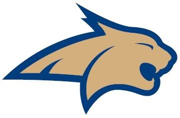
As a clarification, what someone was saying about the recruit commenting on the "dead rat" being the old version I think it was in reference to this version of the cat as pointed out by Coach in a previous post:AlphaOAlum wrote:Yep. In a spectrum of 1-10, with 1 being low and 10 being high, I'd say the script 'Cats is a 9, the old school Bobcat head is a 6 and the "dead rat head" or "puking panther" is a... 2? It was only instituted as a logo for athletics in 1997, I believe.Hawks86 wrote:Just for clarity. The one that some of you dislike is not the one in the middle of the field, is it ?
There. I've said it. I don't like the elongated bobcat logo. I also drive a foreign vehicle, put cream in my coffee and occasionally jaywalk if oncoming traffic allows. What a dissenter!

This was changed mid-2000's to the current one as seen in the original post of this thread which is not as "elongated."
The old one above is the one that was on the helmet in the late 90's just before Kramer came. I hated the look of those helmets, and didn't like that logo but I do like the newer cat head. As much as I really like the Cats script logo, the new cat head is the most recognizable and identifiable logo MSU has to use in my opinion.
Edit: Apparently I was a bit slow in getting this in
“Arguing with anonymous strangers on the Internet is a sucker's game because they almost always turn out to be—or to be indistinguishable from—self-righteous sixteen-year-olds possessing infinite amounts of free time.” -- Neal Stephenson, Cryptonomicon
-
bpcats
- Member # Retired
- Posts: 2186
- Joined: Tue Mar 14, 2006 10:36 pm
Re: Which logo do you prefer?
If I remember correctly the football program adopted the M on the side of the helmet to go with University's branding theme at the time. Makes sense but a lot of times reminds people of Michigan program especially on caps.
My own preference would be for one of the Bobcat heads so that it would be unique and couldn't be confused with other teams. But whether it actually looks good on the helmet remains to be seen.
I would settle for the Cat script although I think that there are look alikes somewhere.. I like it better than the large M.
The Griz seem to have the right idea as they have no problems with branding. I like both their helmets which include Griz script or their newest Griz Paw that covers the back of the helmet.
I would like a helmet design that doesn't get confused with some other team. Something original.
-
longhorn_22
- Golden Bobcat
- Posts: 7592
- Joined: Thu Feb 24, 2005 11:43 pm
- Location: Billings/Bozeman
Re: Which logo do you prefer?
Agreed. I like the way you put that.kmax wrote: The old one above is the one that was on the helmet in the late 90's just before Kramer came. I hated the look of those helmets, and didn't like that logo but I do like the newer cat head. As much as I really like the Cats script logo, the new cat head is the most recognizable and identifiable logo MSU has to use in my opinion.
-
DicTater
- BobcatNation Team Captain
- Posts: 692
- Joined: Tue Aug 24, 2010 11:27 am
Re: Which logo do you prefer?
THE dumbest thing MSU ever did was going away from the Cats script on the helmets. Not only did they lose the iconic word worn on the helmets of 2 championship teams, it allowed the Griz to steal the script without a peep from MSU. I love the Cats script, but face facts, it's been usurped by UM. Therefore, we have to go with bobcat head logo since the M is kind of meaningless and incredibly boring.
-
94VegasCat

- Golden Bobcat
- Posts: 4199
- Joined: Tue Sep 14, 2004 9:38 am
- Location: Physically in northern Montana but my heart and soul are in Bobcat Stadium
Re: Which logo do you prefer?
I took the script logo and turned it white with gold lines tracing the letters, with a blue background. I'm not smart enough to post the picture though.
I like all the logos, but really like the script the most.
I like all the logos, but really like the script the most.
GO CATS GO. ESG! GO CATS GO
-
cats2506

- Golden Bobcat
- Posts: 9232
- Joined: Wed Jun 13, 2007 4:35 pm
- Location: Lewistown
Re: Which logo do you prefer?
I thought the '76 team had a plain gold helmet without any logo on it. Just what I remember, but its been awhile tooDicTater wrote:THE dumbest thing MSU ever did was going away from the Cats script on the helmets. Not only did they lose the iconic word worn on the helmets of 2 championship teams, it allowed the Griz to steal the script without a peep from MSU. I love the Cats script, but face facts, it's been usurped by UM. Therefore, we have to go with bobcat head logo since the M is kind of meaningless and incredibly boring.
PlayerRep wrote:The point is not the record of the teams UM beat, it's the quality and record of the teams UM almost beat.
-
longhorn_22
- Golden Bobcat
- Posts: 7592
- Joined: Thu Feb 24, 2005 11:43 pm
- Location: Billings/Bozeman
Re: Which logo do you prefer?
I believe you are correct.cats2506 wrote:I thought the '76 team had a plain gold helmet without any logo on it. Just what I remember, but its been awhile tooDicTater wrote:THE dumbest thing MSU ever did was going away from the Cats script on the helmets. Not only did they lose the iconic word worn on the helmets of 2 championship teams, it allowed the Griz to steal the script without a peep from MSU. I love the Cats script, but face facts, it's been usurped by UM. Therefore, we have to go with bobcat head logo since the M is kind of meaningless and incredibly boring.
-
GOKATS

- Golden Bobcat
- Posts: 9271
- Joined: Wed Apr 27, 2005 4:33 pm
- Location: Bozeman
Re: Which logo do you prefer?
longhorn_22 wrote:I believe you are correct.cats2506 wrote:I thought the '76 team had a plain gold helmet without any logo on it. Just what I remember, but its been awhile tooDicTater wrote:THE dumbest thing MSU ever did was going away from the Cats script on the helmets. Not only did they lose the iconic word worn on the helmets of 2 championship teams, it allowed the Griz to steal the script without a peep from MSU. I love the Cats script, but face facts, it's been usurped by UM. Therefore, we have to go with bobcat head logo since the M is kind of meaningless and incredibly boring.
Yep, correct.
FTG!!
[quote="GrizinWashington"]The Griz suck.
[quote=" tampa_griz"] (because China isn't a part of "Asia") .....


[quote="GrizinWashington"]The Griz suck.
[quote=" tampa_griz"] (because China isn't a part of "Asia") .....
-
Killdeer Cat
- BobcatNation Redshirt
- Posts: 97
- Joined: Tue Nov 02, 2010 9:17 am
- Location: Killdeer North Dakota
Re: Which logo do you prefer?
I despise the M, like the Cat head logo, but I love the CATS script. Never liked the M and never will. I would buy twice as much MSU shwag if they brought the script back full time.
-
083190
- 2nd Team All-BobcatNation
- Posts: 1031
- Joined: Fri Dec 17, 2004 12:47 pm
Re: Which logo do you prefer?
The gold fill in the current cat head logo would wash out against the gold helmets. It would have to be modified to show up well on the helmets. Like the cat head logo, but not on the helmets as it is now. Not a big fan of the script logo. It seems kinda tired. The M is okay, but it just seems like it is a little off.
-
longhorn_22
- Golden Bobcat
- Posts: 7592
- Joined: Thu Feb 24, 2005 11:43 pm
- Location: Billings/Bozeman
Re: Which logo do you prefer?
It would be a blue Cat head.083190 wrote:The gold fill in the current cat head logo would wash out against the gold helmets. It would have to be modified to show up well on the helmets. Like the cat head logo, but not on the helmets as it is now. Not a big fan of the script logo. It seems kinda tired. The M is okay, but it just seems like it is a little off.