Which logo do you prefer?
Moderators: rtb, kmax, SonomaCat
-
bobcatozzy

- 2nd Team All-BobcatNation
- Posts: 1236
- Joined: Mon Oct 19, 2009 7:05 am
-
classicat
- BobcatNation Letterman
- Posts: 238
- Joined: Tue Nov 09, 2010 4:14 pm
Re: Which logo do you prefer?
So not to burst any bubbles but is the revamping of the logo even being discussed among the powers that be or is this just wintertime folly? I really like the designs presented alot and the voting is all well and fine, but is MSU Athletics interested in changing the logo to something new and if so, will they consider the opinions of Bobcat Nation bloggers? Just wondering. I think Old Skool Cat did an awesome job though! 
-
cat_stache_fever

- 2nd Team All-BobcatNation
- Posts: 1373
- Joined: Tue Aug 19, 2008 9:30 pm
- Location: dirt falls, montana
- Contact:
Re: Which logo do you prefer?
i'll take wintertime folly for 500 alex...classicat wrote:So not to burst any bubbles but is the revamping of the logo even being discussed among the powers that be or is this just wintertime folly? I really like the designs presented alot and the voting is all well and fine, but is MSU Athletics interested in changing the logo to something new and if so, will they consider the opinions of Bobcat Nation bloggers? Just wondering. I think Old Skool Cat did an awesome job though!
well.......we gonna pitch it!
"we gonna put something/somebody(?) on they ass...."
http://www.youtube.com/watch?v=-cXf-VrzznY" onclick="window.open(this.href);return false;
"we gonna put something/somebody(?) on they ass...."
http://www.youtube.com/watch?v=-cXf-VrzznY" onclick="window.open(this.href);return false;
-
Dubs
- New Recruit
- Posts: 8
- Joined: Thu Jan 06, 2011 3:19 am
Re: Which logo do you prefer?
Old Skool Cat wrote:Here's some images I have played around with; don't know if you'll like any of them:
Can you make a image of the "M" w/ the "state" script but with out the curves. Maybe do a couple variations. Just would like to see how they look.
-
classicat
- BobcatNation Letterman
- Posts: 238
- Joined: Tue Nov 09, 2010 4:14 pm
Re: Which logo do you prefer?
Haha cat_stache, nice. But seriously, with the effort Old Skool put in, what would it take to submit/suggest something new and exciting? Change can be good and riding on last year's success, the new stadium, etc., might be time for a new marketing campaign.
-
Old Skool Cat

- BobcatNation Hall of Famer
- Posts: 3143
- Joined: Mon Oct 29, 2007 11:54 am
Re: Which logo do you prefer?
No problem! I am away from my graphics computer right now, but I will work on that. I have thought that might be a good combination myself.Dubs wrote:Old Skool Cat wrote:Can you make a image of the "M" w/ the "state" script but with out the curves. Maybe do a couple variations. Just would like to see how they look.

-
Old Skool Cat
- BobcatNation Hall of Famer
- Posts: 3143
- Joined: Mon Oct 29, 2007 11:54 am
Re: Which logo do you prefer?
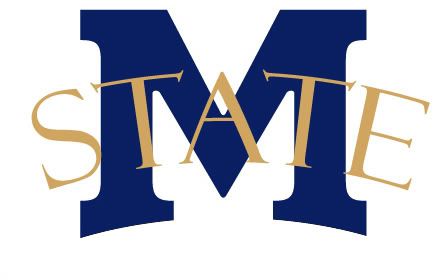
For comparison sake, here's some logos from other state school that incorporate the "State" and the letter:Old Skool Cat wrote:No problem! I am away from my graphics computer right now, but I will work on that. I have thought that might be a good combination myself.Dubs wrote:Old Skool Cat wrote:Can you make a image of the "M" w/ the "state" script but with out the curves. Maybe do a couple variations. Just would like to see how they look.
Ohio State:

Oklahoma State
Iowa State
Mississippi State
One logo I have always liked was Memphis'. It incorporates an "M" very similar to ours but also includes the mascot.
-
catsrback76

- Golden Bobcat
- Posts: 8743
- Joined: Mon Oct 10, 2005 11:18 am
- Location: Sitting on the hill looking at the Adriatic!
Re: Which logo do you prefer?
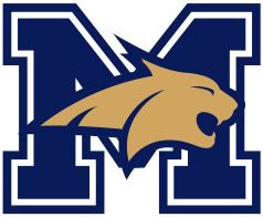
Or this!kmax wrote:This is the one that they have put on the signs distributed to businesses around town that I really like, similar to what you are saying about slight modifications to accentuate the features. I like it because it gives it a little more depth and accentuates as you say but still stays simple (only a three color logo still). Note this is just me making the standard logo look like the one on the sign in my office so it's not perfect. And I added the white to the eye.catsrback76 wrote: Script to me is the hardest of all, though I understand the romance of the "Cats" logo from 84. That said, the Cat head with maybe some modifications to it to accentuate it's features, ie. eye, teeth, ears could really make it pop and be seen at a distance and carry our brand forward.
That said, I have no way to even create it.

-
Old Skool Cat
- BobcatNation Hall of Famer
- Posts: 3143
- Joined: Mon Oct 29, 2007 11:54 am
Re: Which logo do you prefer?
Very nice kmax, I like it alot! The white would also give some definition on a helmet.kmax wrote:This is the one that they have put on the signs distributed to businesses around town that I really like, similar to what you are saying about slight modifications to accentuate the features. I like it because it gives it a little more depth and accentuates as you say but still stays simple (only a three color logo still). Note this is just me making the standard logo look like the one on the sign in my office so it's not perfect. And I added the white to the eye.catsrback76 wrote: Script to me is the hardest of all, though I understand the romance of the "Cats" logo from 84. That said, the Cat head with maybe some modifications to it to accentuate it's features, ie. eye, teeth, ears could really make it pop and be seen at a distance and carry our brand forward.
That said, I have no way to even create it.
-
TIrwin24

- BobcatNation Hall of Famer
- Posts: 3609
- Joined: Thu Jan 11, 2007 1:00 pm
- Location: Bow, WA
Re: Which logo do you prefer?
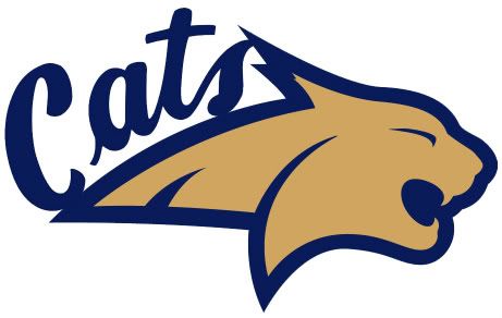
Even after all these ideas, I still think that the 'Cats in script captures the classic look while maintaining a unique image that MSU needs to get back to.
I could care less that the griz are using it right now. We all know that we had it first, and that they copied our idea.
What would be even better is to have Away helmets that would be dark blue with the script in gold. SIIICK!
I could care less that the griz are using it right now. We all know that we had it first, and that they copied our idea.
What would be even better is to have Away helmets that would be dark blue with the script in gold. SIIICK!
"I've always followed in my father's footsteps, not necessarily because I wanted to, but because it is in my spirit."
-Singlefin Yellow
-Singlefin Yellow
-
Bleedinbluengold

- BobcatNation Hall of Famer
- Posts: 3427
- Joined: Mon Apr 05, 2004 10:24 am
- Location: Belly of the Beast
Re: Which logo do you prefer?
No way! Not in SanFran. I don't believe you.Bay Area Cat wrote:Well, it makes everyone think we are Michigan (especially when the M has yellow in it) ... at least that's been the reaction from 99% of the people who comment when I wear my gear.LTown Cat wrote:The M separates us.
I like the cat head the best, personally.
I bet if you took a "real" poll, more than 100 people would know that's not Michigan.
Montana State IS what "they" think Montana is.
-
ABQCat

- 2nd Team All-BobcatNation
- Posts: 1002
- Joined: Sun Oct 07, 2007 1:26 pm
- Location: Helena
Re: Which logo do you prefer?
I could have sworn we already... wait a minute... it's coming to me.... oh yeah, now I remember. We already have 111 posts on this subject. 
BUMP!
BUMP!

-
CatfaninGA

- Honorable Mention All-BobcatNation
- Posts: 795
- Joined: Tue Mar 30, 2004 11:26 am
- Location: Sandy Springs, GA
Re: Which logo do you prefer?
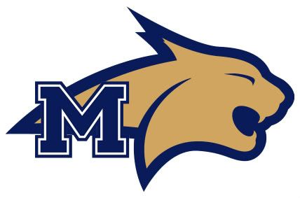
The cat head looks like Washington States step child had a kid.
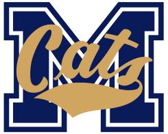
Maybe I'm old school but I like the script CATS but overlayed on the M looks good as well.
What about the Old old school logo that used to be on the rubber basketball court at the brick with the actual Bobcat head?
Maybe I'm old school but I like the script CATS but overlayed on the M looks good as well.
What about the Old old school logo that used to be on the rubber basketball court at the brick with the actual Bobcat head?
-
CelticCat

- Golden Bobcat
- Posts: 12215
- Joined: Thu Apr 01, 2004 12:55 pm
- Location: Upper Northwest WA
- Contact:
Re: Which logo do you prefer?
And a fancy poll!
R&R Cat Cast - the only Bobcat fan podcast - https://www.rrcatcast.com
Twitter - https://twitter.com/rrcatcast
Twitter - https://twitter.com/rrcatcast
-
catbooster
- Honorable Mention All-BobcatNation
- Posts: 886
- Joined: Fri Dec 03, 2004 12:23 am
- Location: Bozeman
Re: Which logo do you prefer?
So this thread wasn't offseason boredom, it was Bobcat Nation being ahead of their time once again.
-
CatBlitz

- Golden Bobcat
- Posts: 7589
- Joined: Sat Jan 29, 2011 11:27 pm
- Location: B Town
Re: Which logo do you prefer?
And might I remind you who started this brilliance...catbooster wrote:So this thread wasn't offseason boredom, it was Bobcat Nation being ahead of their time once again.
Don't let this distract you from the fact that the griz blew a 22-0 lead.
-
catsrback76
- Golden Bobcat
- Posts: 8743
- Joined: Mon Oct 10, 2005 11:18 am
- Location: Sitting on the hill looking at the Adriatic!
Re: Which logo do you prefer?
I stand by my original design of the accented Cat Head! Very nice indeed.