Ad blocker detected: Our website is made possible by displaying online advertisements to our visitors. Please consider supporting us by disabling your ad blocker on our website.
Discuss anything and everything relating to Bobcat Football here.
Moderators: rtb, kmax, SonomaCat
-
nevadacat
- Member # Retired
- Posts: 2070
- Joined: Mon Oct 17, 2005 11:25 am
- Location: Vegas, baby!
Post
by nevadacat » Tue Jan 18, 2011 8:04 pm
DicTater wrote:THE dumbest thing MSU ever did was going away from the Cats script on the helmets. Not only did they lose the iconic word worn on the helmets of 2 championship teams, it allowed the Griz to steal the script without a peep from MSU. I love the Cats script, but face facts, it's been usurped by UM. Therefore, we have to go with bobcat head logo since the M is kind of meaningless and incredibly boring.
I believe the griz adopted the script logo on their helmets before we stopped using it. It's not like we threw it away and they went through our trash. To me, their imitation of us is a form of flattery.
Sent from my iPod using Tapatalk
...for today we raise, the BLUE and GOLD to wave victorious!... GO CATS GO!
-
MSU01
- Golden Bobcat
- Posts: 7697
- Joined: Mon Mar 29, 2004 5:21 pm
Post
by MSU01 » Tue Jan 18, 2011 8:07 pm
Wow, current voting results are 23-24-24! Apparently we have a split opinion and should go with the M logo on the left side, Cat head on the right side, and script Cats on the back of the helmet.
My opinion: Would love to see the script Cats logo return, but I also really like the current M. I tend to go with Bobcat gear featuring the head logo to avoid any confusion with Michigan...
-
GOKATS
- Golden Bobcat
- Posts: 9271
- Joined: Wed Apr 27, 2005 4:33 pm
- Location: Bozeman
Post
by GOKATS » Tue Jan 18, 2011 8:22 pm
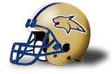
longhorn_22 wrote:083190 wrote:The gold fill in the current cat head logo would wash out against the gold helmets. It would have to be modified to show up well on the helmets. Like the cat head logo, but not on the helmets as it is now. Not a big fan of the script logo. It seems kinda tired. The M is okay, but it just seems like it is a little off.
It would be a blue Cat head.
This was the '97-'99 helmet, which I never liked. I just don't see where the "new" cat head would look much better.

FTG!!
[quote="GrizinWashington"]The Griz suck.
[quote=" tampa_griz"] (because China isn't a part of "Asia") .....


-
longhorn_22
- Golden Bobcat
- Posts: 7592
- Joined: Thu Feb 24, 2005 11:43 pm
- Location: Billings/Bozeman
Post
by longhorn_22 » Tue Jan 18, 2011 8:28 pm
GOKATS wrote:longhorn_22 wrote:083190 wrote:The gold fill in the current cat head logo would wash out against the gold helmets. It would have to be modified to show up well on the helmets. Like the cat head logo, but not on the helmets as it is now. Not a big fan of the script logo. It seems kinda tired. The M is okay, but it just seems like it is a little off.
It would be a blue Cat head.
This was the '97-'99 helmet, which I never liked. I just don't see where the "new" cat head would look much better.
Trust me, it looks better. I'll try to snag a pic.
-
KittieKop
- BobcatNation Hall of Famer
- Posts: 3746
- Joined: Mon Mar 03, 2008 3:03 pm
- Location: Helena
Post
by KittieKop » Tue Jan 18, 2011 8:36 pm
Huh. I voted to stay with the "M" logo, leaving the poll in a 3-way tie at 25. Hardly seems to be a consensus one way or the other (or the other). So whatever happens of these three options, the only sure thing is that 2/3 of us won't agree!
"It was like a coordinated effort by the Missoulian and the police to bring UM Football program down..."
eGriz 11/30/12
Now where did I leave my tinfoil hat?

-
Hawks86
- Golden Bobcat
- Posts: 10614
- Joined: Sat Jan 06, 2007 3:27 pm
- Location: MT
Post
by Hawks86 » Tue Jan 18, 2011 8:39 pm
Lets scrap all three and use


"I'm a Bobcat forever its in my soul..."
-
ilovethecats
- Golden Bobcat
- Posts: 6511
- Joined: Wed Nov 24, 2010 8:12 pm
Post
by ilovethecats » Tue Jan 18, 2011 8:40 pm
MSU01 wrote:
My opinion: Would love to see the script Cats logo return, but I also really like the current M. I tend to go with Bobcat gear featuring the head logo to avoid any confusion with Michigan...
that's why a big M with smaller script "cats" going through it would please everybody.
-
longhorn_22
- Golden Bobcat
- Posts: 7592
- Joined: Thu Feb 24, 2005 11:43 pm
- Location: Billings/Bozeman
Post
by longhorn_22 » Tue Jan 18, 2011 8:46 pm
I did this awhile back with the new Cat head but it's not blue. I'm trying to do one that's blue that doesn't look like poo.
Might have one done tomorrow. And like I said I'll try an get a picture of a real helmet with the Cat head.
Last edited by
longhorn_22 on Tue Jan 18, 2011 9:25 pm, edited 1 time in total.
-
Helcat72
- Golden Bobcat
- Posts: 4295
- Joined: Mon Mar 29, 2004 9:47 pm
- Location: Helena
Post
by Helcat72 » Tue Jan 18, 2011 8:49 pm
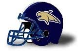
longhorn_22 wrote:I did this awhile back with the new Cat head but it's not blue. I'm trying to do one that's blue that doesn't look like poo.
Try the gold Bobcat with a blue helmet!
2024 Resume dominance
-
longhorn_22
- Golden Bobcat
- Posts: 7592
- Joined: Thu Feb 24, 2005 11:43 pm
- Location: Billings/Bozeman
Post
by longhorn_22 » Tue Jan 18, 2011 8:58 pm
Helcat72 wrote:longhorn_22 wrote:I did this awhile back with the new Cat head but it's not blue. I'm trying to do one that's blue that doesn't look like poo.
Try the gold Bobcat with a blue helmet!
It's terrible, but when I do it in 5 minutes this is what you get.

-
grizzh8r
- Golden Bobcat
- Posts: 6910
- Joined: Sat Feb 19, 2005 11:23 pm
- Location: Billings via Livingston
Post
by grizzh8r » Tue Jan 18, 2011 10:44 pm
longhorn_22 wrote:Helcat72 wrote:longhorn_22 wrote:I did this awhile back with the new Cat head but it's not blue. I'm trying to do one that's blue that doesn't look like poo.
Try the gold Bobcat with a blue helmet!
It's terrible, but when I do it in 5 minutes this is what you get.
Ugh. Looks too much like NAU. Stick with the M. Besides, we're not the only university to use an M. There's Memphis, Marshall, Mississippi State, Missouri...
Eric Curry
STILL makes me sad.
94VegasCat wrote:Are you for real? That is just a plain ol dumb paragraph! You just nailed every note in the Full Reetard sing-a-long choir!!!

-
catzz
- BobcatNation Team Captain
- Posts: 483
- Joined: Sun Aug 13, 2006 7:12 pm
- Location: Missoula
Post
by catzz » Tue Jan 18, 2011 11:45 pm
I would love to separate ourselves from every all the other schools and get away from the M. I had a hard time deciding between the Cats and the Cat logo. I think if done right the logo could be very cool!
-
MSU01
- Golden Bobcat
- Posts: 7697
- Joined: Mon Mar 29, 2004 5:21 pm
Post
by MSU01 » Tue Jan 18, 2011 11:57 pm
A 50+ post thread about helmet logos...and it's only January! GAH, is it September yet???

P.S. the blue helmet looks pretty awesome, but I think we have to stick with the traditional gold!
-
TIrwin24
- BobcatNation Hall of Famer
- Posts: 3610
- Joined: Thu Jan 11, 2007 1:00 pm
- Location: Bow, WA
Post
by TIrwin24 » Wed Jan 19, 2011 8:17 am
nevadacat wrote:DicTater wrote:THE dumbest thing MSU ever did was going away from the Cats script on the helmets. Not only did they lose the iconic word worn on the helmets of 2 championship teams, it allowed the Griz to steal the script without a peep from MSU. I love the Cats script, but face facts, it's been usurped by UM. Therefore, we have to go with bobcat head logo since the M is kind of meaningless and incredibly boring.
I believe the griz adopted the script logo on their helmets before we stopped using it. It's not like we threw it away and they went through our trash. To me, their imitation of us is a form of flattery.
Sent from my iPod using Tapatalk
And now with their new helmets; it looks like the entire team got their faces curb-stomped by a teddy bear

"I've always followed in my father's footsteps, not necessarily because I wanted to, but because it is in my spirit."
-Singlefin Yellow
-
Dubs
- New Recruit
- Posts: 8
- Joined: Thu Jan 06, 2011 3:19 am
Post
by Dubs » Wed Jan 19, 2011 8:50 am
The "M" is best. Simple, traditional, and timeless
-
TIrwin24
- BobcatNation Hall of Famer
- Posts: 3610
- Joined: Thu Jan 11, 2007 1:00 pm
- Location: Bow, WA
Post
by TIrwin24 » Wed Jan 19, 2011 9:33 am
I think RTB said it best when he said that MSU needs to create its own identity. We need to get away from the images and symbols that other colleges around the nation use and go back to something that is uniquely ours. The "M" is so overused and common amongst other colleges that it's just stupid to think that it is "our symbol."
As much as I hate to say it and as much as I hate the griz, they really did come up with a clever idea with that paw print on their helmets. It's unique, and something the griz can identify themselves by.
Maybe this project can be undertaken by a graphic arts student as a final project?
"I've always followed in my father's footsteps, not necessarily because I wanted to, but because it is in my spirit."
-Singlefin Yellow
-
technoCat
- Golden Bobcat
- Posts: 4293
- Joined: Thu Oct 04, 2007 5:06 pm
- Location: Bozeman
Post
by technoCat » Wed Jan 19, 2011 10:55 am
I am a huge fan of the 'M' on the helmets. It looks clean and just makes us look like a big time program. I don't really mind the other logo's on hats and fangear, but I really like the M on the helmet. I buy lots of hats with the M on them and it gets confused with Michigan(usually by someone who doesn't like Michigan) and I politely inform them that it is for THE MSU Fighting Bobcats. I'll usually get a blank expression but that's ok with me. The truth is Michigan's 'M' looks different than ours and if people can't tell the difference, I'll explain it and send them on their way. I think if we changed logo's most people I meet outside of Montana wouldn't know what it was anyway and I would have to explain it.
DIE HARD CATS FAN SINCE THE DAY I WAS BORN
-
CelticCat
- Golden Bobcat
- Posts: 12215
- Joined: Thu Apr 01, 2004 12:55 pm
- Location: Upper Northwest WA
-
Contact:
Post
by CelticCat » Wed Jan 19, 2011 12:28 pm
While I agree that the 'M' is a bit confusing in regards to Michigan, I still believe it is the best option. I agree with the above statement that it makes us look like a big time program. Our uniforms are clean, and professional. How many FCS programs have you seen in the country that honestly resemble high school uniforms/logo (heck, just in the Big Sky alone)? I think we have one of the best things going in terms of style/look in FCS, and I wouldn't mess with it.
I have said in the past that I wish we would be a little more uniform in terms of marketing, however. Either stick with the 'M' or the cat head, and better yet stick with a color scheme. Almost all our popular merchandise is old-school blue and "gold" (yellow). I love the gold rush, but that isn't even close to our shade of gold. It is nice having a variety but sometimes it just doesn't really make sense to me.
-
HelenaCat
- Honorable Mention All-BobcatNation
- Posts: 907
- Joined: Mon Mar 29, 2004 1:26 pm
- Location: Bozeman, MT
Post
by HelenaCat » Wed Jan 19, 2011 2:02 pm
technoCat wrote:I am a huge fan of the 'M' on the helmets. It looks clean and just makes us look like a big time program. I don't really mind the other logo's on hats and fangear, but I really like the M on the helmet. I buy lots of hats with the M on them and it gets confused with Michigan(usually by someone who doesn't like Michigan) and I politely inform them that it is for THE MSU Fighting Bobcats. I'll usually get a blank expression but that's ok with me. The truth is Michigan's 'M' looks different than ours and if people can't tell the difference, I'll explain it and send them on their way. I think if we changed logo's most people I meet outside of Montana wouldn't know what it was anyway and I would have to explain it.
True story about why I like the "M": While travelling back east, I got on the airplane and was wearing a Bobcat Quarterback Club sweater and hat. Both had the M on them. A lady asked me if I played quarterback at Michigan.... While I was really tempted to say yes, I did tell her the truth. But it was flattering in any case!

-
SonomaCat
- Moderator
- Posts: 23960
- Joined: Tue Mar 09, 2004 7:56 pm
- Location: Sonoma County, CA
-
Contact:
Post
by SonomaCat » Wed Jan 19, 2011 2:10 pm
Conceptually, I really like the M.
Had we thought of it 100 years ago, that would have been awesome.
But when we adopt a logo that looks very, very similar to another school's long-held logo, it really complicates things.
If we could just convince Michigan to abandon the M, I think it would be perfect for MSU. But absent that, it really does come off as us copying Michigan ... and that's not great marketing.


